Art Class – Welcome to the Artists’ world of colour terminology
Entering the artist’s world, you are going to come accross different terminology whether it is watercolours, acrylics, oils or also any other colour medium. You may have heard of the colour wheel above. This is a guide for you to determine the different colours ie primary, secondary or tertiary. You can learn more in one of our art class courses.
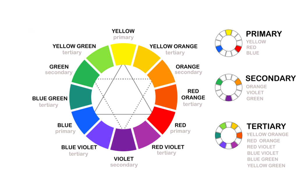
Primary Colours
These are the colours that cannot be created by mixing any other colour. They are red, blue and yellow. These colours can be mixed together to create any other colour. Colours created by mixing primaries are also more organic that pre-mixed shop bought colours
Secondary Colours
These are created from mixing any 2 primaries. They are orange (yellow + red) , green (yellow + blue) and violet (red + blue).
Tertiary Colours
These are created when you mix a secondary colour with primary. Eg blue + green create a blue-green or turquoise or violet + blue creates a blue-violet.
Complementary Colours
Colours that are opposite each other on the colour wheel complement each other. Therefore, they enhance each other when they are placed next each other. For instance, green and red complement each other. However, if mixed together, they will produce the opposite effect. Above all, they will appear dull. Have a look above at the colour wheel to see all the colours
Art Class Courses – Beyond Colour
Chroma
This refers to the vividness of the colour. It is also referred to as saturation or intensity of the colour. It is the purity of the colour and does not have either white or black or grey added to it.
Hue
This is referred to as the colour and is the most vivid version of the primary, secondary or teritary colour. So blue without any colour mixed with it is a hue. Painting with just the hue will lead to very bright and creates a very flash and gaudy painting
Tint
Adding white to colour to lighten it. In watercolour paints , as we do not usually use white, we just had water to lighten the colour
Shade
Adding black to a colour to darken it, creates a shade of that colour. However black is very dominating colour and can overtake the colour. Instead mix the 3 primary colours together to get black and add this to the colour to darken it. Another way to darken is to add the complementary colour to it. eg add violet to yellow to darken
Tone
Adding black and white (grey) , creates a greyer version of the colour which is called the tone of that colour. They are also referred to as pastel colours
Value
This is the lightness and darkness of a colour. You might think that blue is darker than yellow but a light blue may be lighter than a dark yellow. The best way to determine the value is to turn it into black and white and this will help you determine darker and lighter colours